Artist Mark Bischel, our December juror, has made a name for himself by capturing the energy of New York City streets after dark. We caught up with him on a recent morning to talk about why nighttime is the right time for drawing, the things that feed him creatively, and what he liked most about the award winners he picked in this month’s Open Exhibit.
By Julia Chance
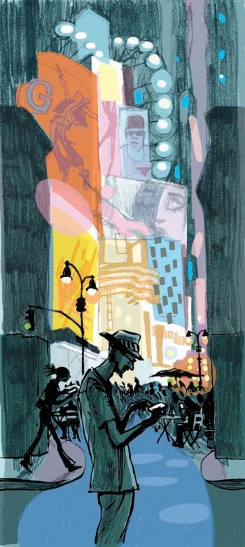
About a decade ago, New York-based illustrator Mark Bischel created a deck of cards based on the 19th-century optical novelty myriorama where picture cards can be arranged in different combinations to become a single image. Bischel’s scenes captured the routine dynamism of the city—a person descending subway stairs; a grocery clerk manning a flower stand; a man caught in the glow of his smartphone amid the glow of Times Square; bicyclists and pedestrians heading across the Brooklyn Bridge. The cards became a short-lived museum souvenir titled Endless New York. But that title could just as well describe much of Bischel’s work which reflects his ongoing fascination with the Big Apple.
His preoccupation with cityscapes developed out of necessity. When he left a teaching job at the Kansas City Art Institute (KCAI) in Missouri to enter a master’s program at New York’s School of Visual Art (SVA), he says, “My work was scattered, and I didn’t feel very good about it.” The SVA program required students to make work based on an overarching theme.
“I started to list the things that I was interested in, and it was all pretty boring and not worthy of a body of work,” he recalls. “But I was amazed at the city—the infrastructure, the subways, the scale. And since the program stressed drawing on location, I just began to draw what I saw around me.”
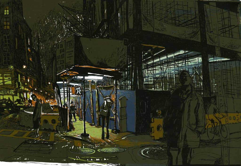
Bischel is especially enamored with New York at night. “I’ve always liked the works of Edward Hopper, and was sort of drawn to night scenes,” he says. “I like the way that the night kind of breaks the picture plane, the light and dark, into dynamic shapes. I like looking for that passageway or that point of light, and the city [at night] is perfect for that.”
Resurfaced, his illustrated book of cityscapes as experienced by a bicyclist at night, is a fine example of the interplay of contrasting shapes that he describes. It began as a plan to print small bound books as calling cards to art directors but evolved into something bigger. The National Gallery of Art Library acquired it two years ago.
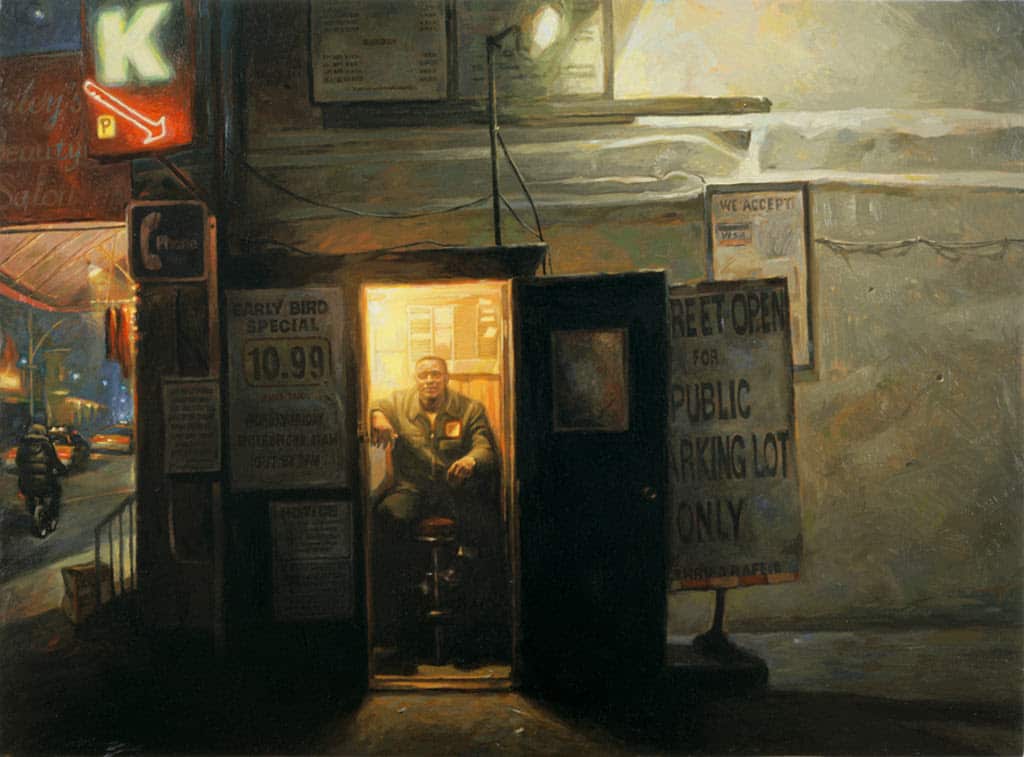
Man in a Box, a portrait series he started in graduate school, captures varied attendants working New York’s ubiquitous outdoor parking lots, illuminated by the light in the booths they occupy. One of those paintings is in the Schwartz Art Collection at Harvard Business School.
For the series Fear of Flying, Bischel trades street scenes for those of air travel. His depictions of passengers pecking on laptops, dozing uncomfortably in the upright position, or enduring cramped seats and runway delays could be considered a sly commentary on the annoyances of flying. But the series stems from the artist’s aerophobia.
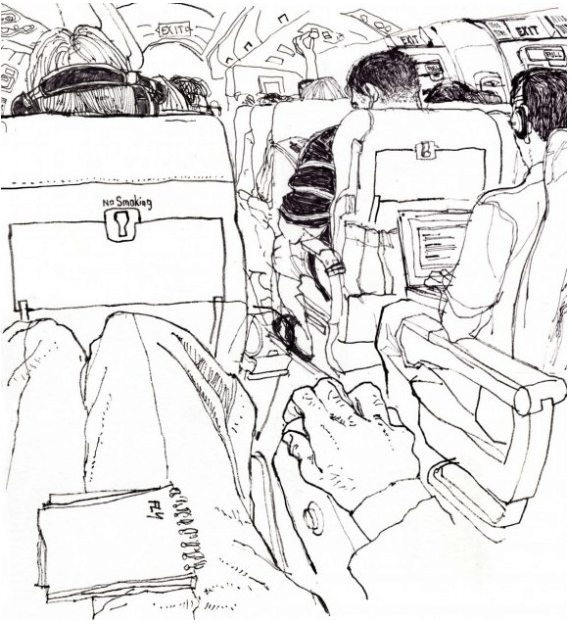
“To get my mind off of being scared witless while flying I usually request an aisle seat and sit there and draw,” is how he describes his in-flight process for creating the pen and ink drawings that he later colors in Photoshop. “Over the years I’ve gotten some really fine drawings from a fearful place.”
Bischel studied commercial art at the University of Central Missouri with plans on becoming a graphic artist. While there he became proficient in the mechanical process of hot metal typesetting which helped land him a job at a design studio after graduation. During that time he also began to illustrate in earnest.
Later, teaching drawing at his alma mater led to an offer to teach in the illustration department at KCAI which he considers a defining point in his career.
“That was a really big step forward for me because I wasn’t just working alone on projects, I was working with faculty members and having to think more about what illustration, drawing, and art meant to me and how to translate that to the students,” he explains. “Teaching is a huge responsibility and it makes me push myself to stand and deliver.”
Another career-defining moment for the artist was when he met noted illustrator Marshall Arisman who was teaching a workshop at KCAI. Arisman also chairs SVA’s Illustration as Visual Essay MFA program that Bischel was interested in. “I said, ‘Marshall, I think I’m going to come and visit you in New York City.’ A year later I entered the program. It was a great experience and I never went back to Kansas City.”
Like a lot of illustrators in New York, Bischel has also worked in advertising. For several years, a gig at Havas Worldwide (now Havas Creative) kept him busy making storyboards and concept visuals for brands like Evian, Volvo, Intel, and Exxon Mobil, as well as the humorous “Most Interesting Man in the World” ad campaign for Dos Equis beer.
As Bischel’s artistry evolved over the years, so did his idea of himself as an artist. “I was always striving to be more of an illustrator than an artist writ large,” he says, mostly due to the conventional belief that an artist could not be both. He cites fine artists like John Sloan, William Glackens, and Edward Hopper, as examples of fine artists whose early vocation as illustrators is not always acknowledged. “Andy Warhol was a a fashion illustrator for a while in the fifties, but you rarely hear about that.”
His experience at SVA, along with becoming immersed in New York’s art scene, helped him to let go of that notion. “Among my peers and the artists I admire that line has blurred,” he notes. “I started considering myself an artist when I changed my way of thinking.”
These days when Bischel is not drawing on location he teaches various drawing courses at SVA. “I enjoy working with students and am amazed by the big leaps in progress that they can make in their work. It is satisfying to see.”
Upon seeing the submissions for the December 2020 Open Exhibit, Bischel says, “I was struck by the number of non-figurative works that were among the entries. There were a lot of pleasant landscapes and photographic work that was especially strong.”
He took his time poring over all of the artwork with three considerations in mind: “I looked at the formal attributes of a piece, what it represented, and how it made me feel.” The biggest challenge? “Narrowing down the honorable mentions. That was tough!” Here are his remarks on those, and the best-in-show.
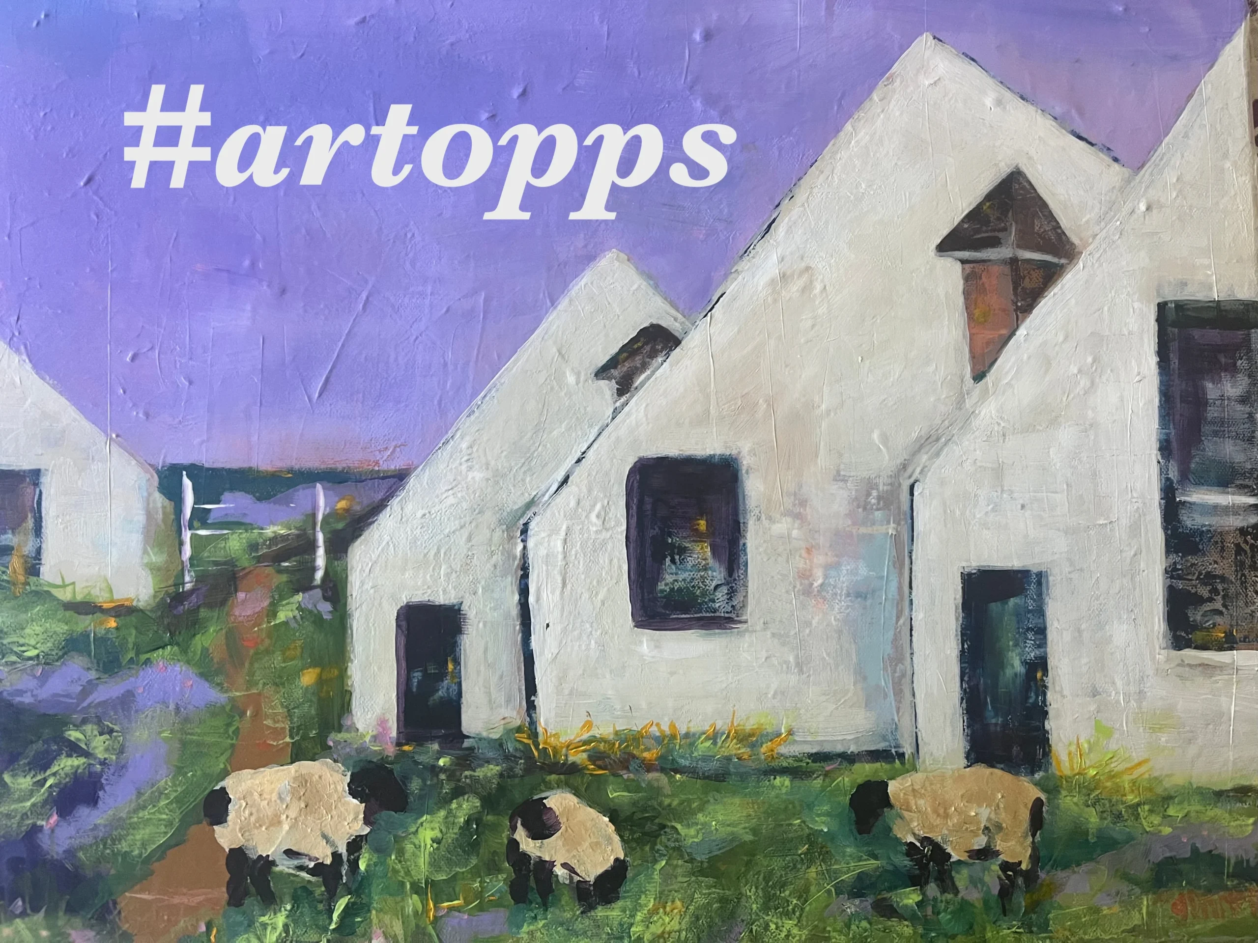
Best-in-Show Award winnerSteel Workers’ Houses by Craig Nedrow

“This is an image that struck me right away. It’s unapologetic. There is the repetition of form, and yet there’s variety in it. I like that tree that is in the foreground, then you’ve got the middle ground of the three houses—like three friends standing there—and then the factory, where those people who live in those houses get out and work every day. It’s one of those pieces of work that makes me think about people’s lives. It’s really beautiful and yet there’s a melancholy to it.”
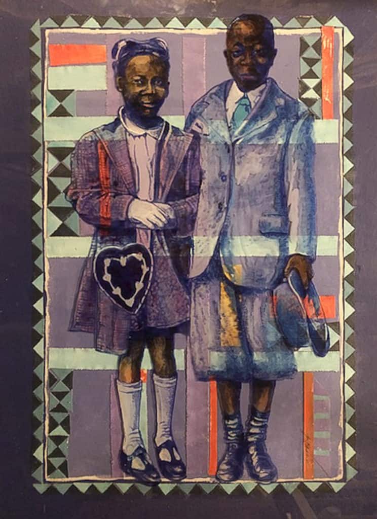
Honorable Mentions:
At the End of the Day by Carol Dawn Petersen
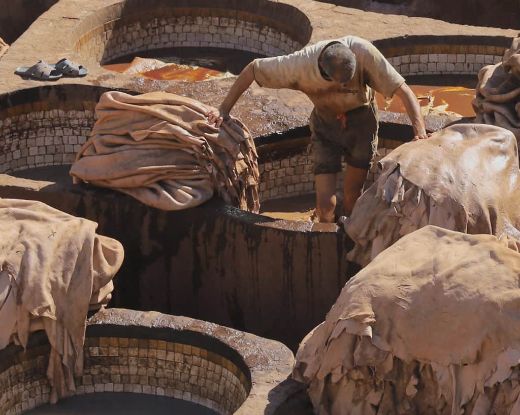
“I like this for the formal reasons, foremost. It’s got a very subdued palette that has great unity. There’s a little note of color, a little red, in the man’s belt. There is a variety of patterns in this that I find interesting—the tile, the five circles, and then the piles of leather being tanned. I love the pattern of light and shadow very much. And then the man. There is something very moving about the way he’s leaning, the way his head is down and his back is hunched, and the way he bridges the two piles of leather. It’s a powerful image. It’s great in an emotional sense, and really compelling and well done in a formal sense.”
Salimigundi by Cynthia Grisdela
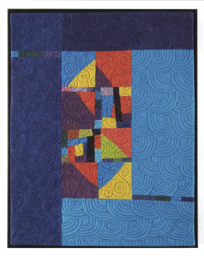
“I love this for almost the same reason that I love the previous work—the intersecting patterns. The swirling pattern changes scale, larger in some areas and a little tighter in others. There’s something wonderful about the design, the variety of colors, and shapes in the middle part. It has a playful but serious feel. I appreciate the way this is constructed. Unlike so much embroidery now being done with computer input, this artist explained that this is done freehand.”
Easter Ritual by Jimmy James Greene
“At first glance, it reminds me of American illustration from the mid-seventies by somebody like Mark English or Bart Forbes—the kind of illustration where there are patterns and figuration. It has that sort of feel, but that’s not really what this is about. I like the way that the orange is balanced throughout the picture. I love the attitude of the figures. There’s an ambiguity to them, but there is also a surety of ritual and in the idea of Easter, which is always a rising up. There is an optimistic feel to it.”
Backyard Jam Session by Judy Guenther
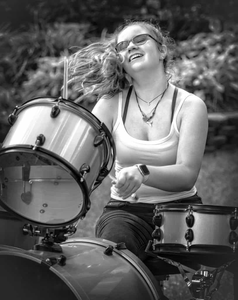
“I like the spontaneity of this. First of all, formally, it’s well done. You’ve got the drums in the foreground, then you have the figure, and that blurred background. The way her hair follows that shrubbery, the sort of a diagonal which is active, is a great counterpoint to these round drum forms. But the main thing about this is the feeling of exhilaration which you don’t often see in a lot of art. The drummer, and the work itself, has an effortless exuberance.”
White Post, Wide by Jo Ann Tooley
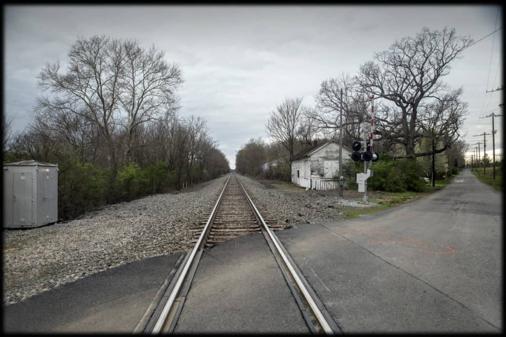
“This is a great example of a piece of artwork where there are two ways out of it. One is with the railroad tracks, very formal, very geometric, going off one-point perspective. Then you’ve got the road cutting across it in a diagonal and it’s more organic. And yet they both go off to different points on the horizon. I love that counterpoint. It is a great feeling of vastness—two ways to go. The number ‘666’ on the ground is interesting, a note of color on the pavement which is kind of spooky. The receding telephone poles going off [in the distance] gives it a feeling of loss or yearning. It’s a beautifully composed shot where everything in it is right where it should be.”
Black Lives Matter by Marta Nammack

“This is of the moment, and sort of sums up the zeitgeist of where we’re at. If you look at this piece maybe thirty years down the road it will be like that [Bernie Boston] photograph of the protester during the Viet Nam War sticking a daisy in the rifle barrel of the National Guardsman. Compositionally, the variety of type—the colors it is in and how things are written—is very active. I love the way the artist placed the young child in the upper right corner. That tree and the apartment building, which represents domicile—family and home—conflicts with him sitting on this hard surface. A lot of things come together to make this a striking piece. “
Inyanga by Kathlyn Avila Reyes
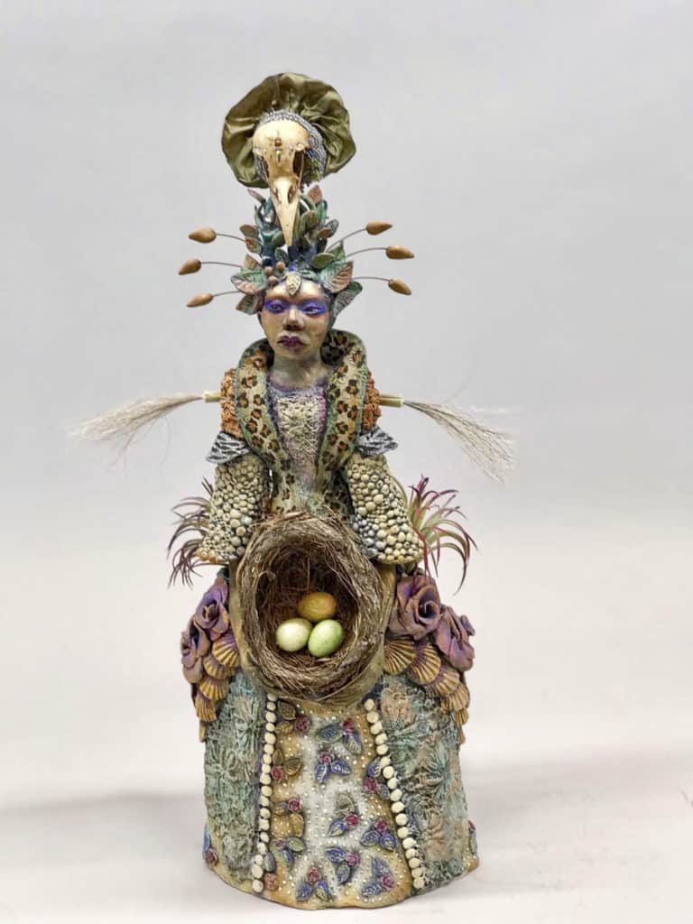
“This came out of left field. My first impression of this was, is it sculpture or is it pottery? I’m glad there were photos of it from different angles that allowed me to see the back of it and the details. The use of a variety of materials is inventive. It’s just spectacular.”
Rivers Edge by Rana Geralis
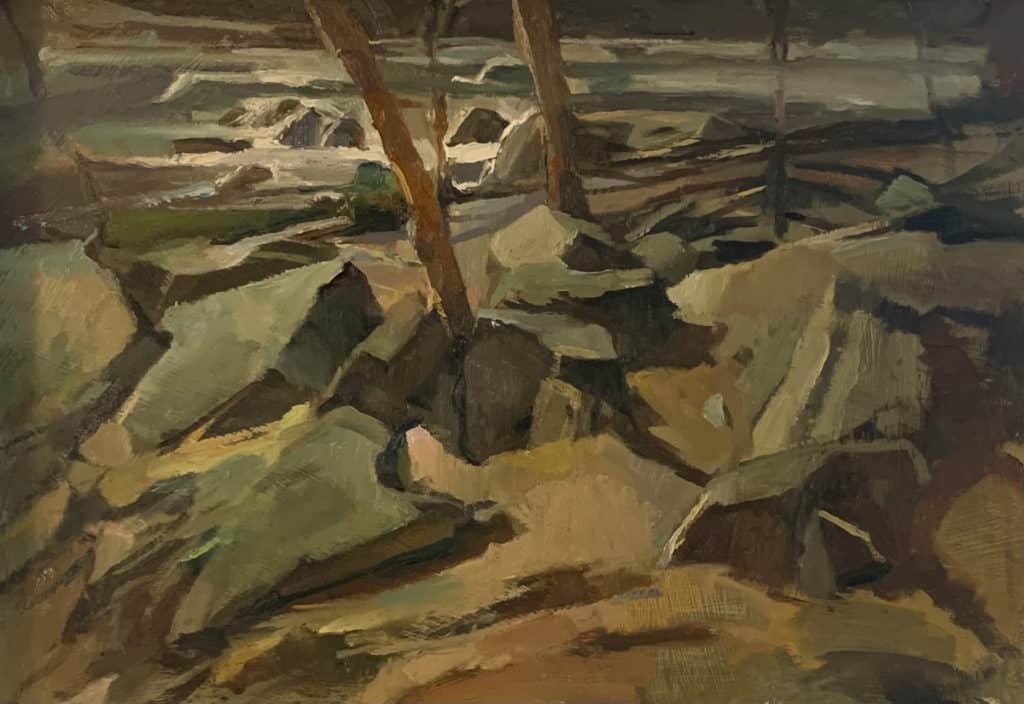
“This has a certain gravitas of fine painting. It reminds me of a Cézanne landscape, There’s a certain shape language it has that shows me that this artist can paint. But it also has a cubist feel to it. I just love the colors and the feel of it, but also the technique and the bravado of the painting seemed very effortless.”
Saturday Morning by Sally Davies
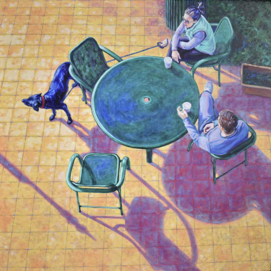
“This one appeals to the illustrator in me and my love for the art. The perspective is what makes this. If it was [a straightforward view of] two people sitting at a table it would be boring. I like the way that it’s centered on this radial—this table—and the variety of shapes going around it, and then those long, warm shadows. It doesn’t represent anything earth-shattering, but it is very humanistic. It’s a small moment that the artist did a really beautiful job of capturing. The point-of-view doesn’t overwhelm the moment.”
Scaffolding on 4th by Sue Canuteson
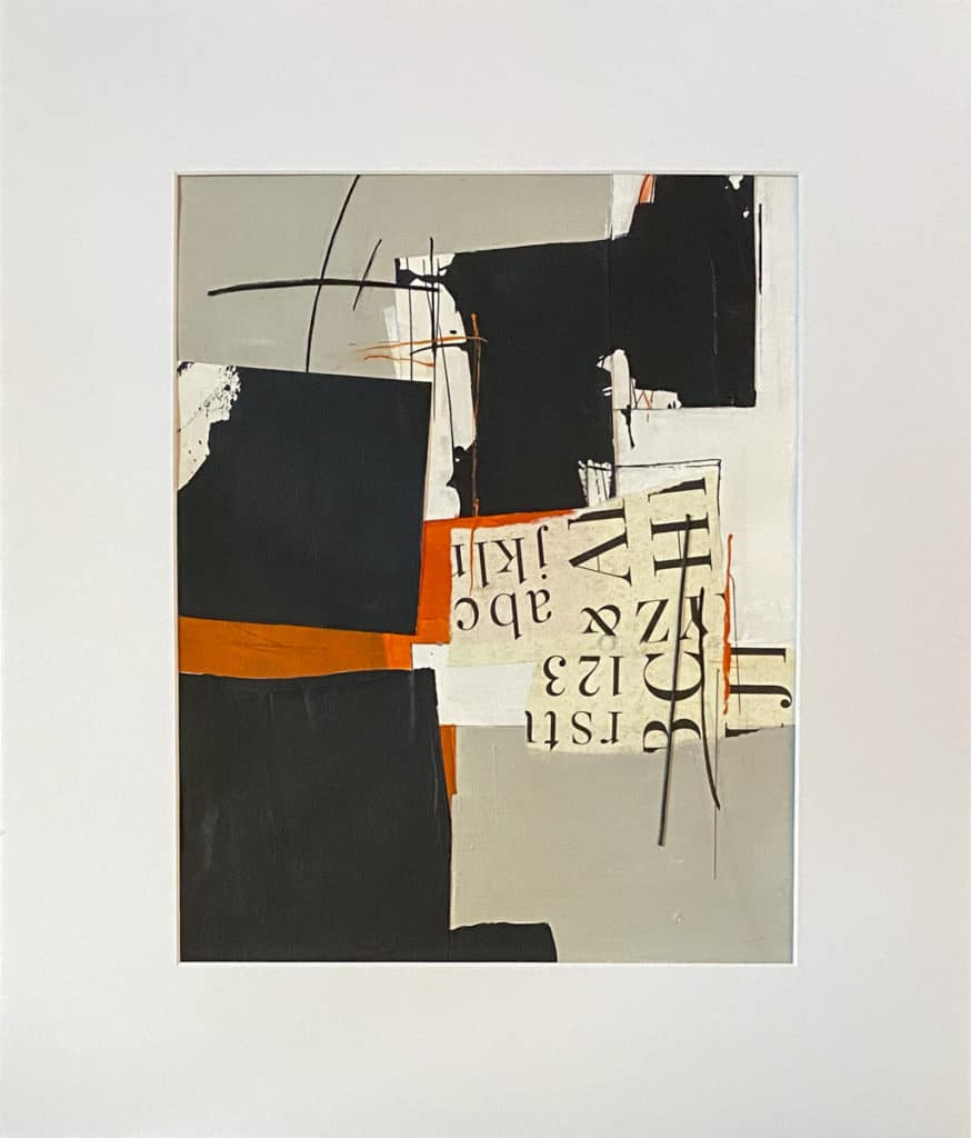
“I like the way everything clicks together—the shape, the type over the top, the notes of red, the grey background, and whatever it is over the top that looks like it could be string. It’s flat but it’s got depth, and the fact that it’s called Scaffolding on 4th is mysterious to me. It seems like it’s wanting to be a landscape, but it’s an abstraction. It’s not overdone, beautifully designed. The title sort of activates the image and you think, yeah, it is a little bit like scaffolding, some little spindly form that you walk under on sidewalks.”
Five Things that Feed Mark Bischel’s Creative Life
1. Life Drawing — “After working on highly art directed illustrations or getting too caught up in my work, I grab whatever drawing tool I have handy and head out to one of the studios in the city to join others in a night of life drawing. I expect that this is the night I will do the worst drawing ever! After a vigorous 3-hour session I feel present and relaxed, and when I return to my work the next day it is with new eyes.”
2. Space, Time, and Effort — “Things will never be perfect, but I find I can do a lot of work over time if I consistently use the available resources I have. It may sound trite, but it works for me.”
3. My Students — “I’ve been a drawing teacher for a few decades now and this responsibility forces me to constantly evaluate what is important in the act of thinking and drawing. Also, just when I think I’ve seen it all in a jaded sort of way, a student will amaze me with work with deep insight.”
4. A Deadline — “I don’t always feel very creative working on my own, so there is nothing better than getting a call for a project for a client, or another opportunity with a deadline. Working with others, especially collaborating with art directors I respect, activates the best in my work.”
5. My Wife — “Every artist should be blessed with at least one other artist they can share their work process with, and in my life it is the artist and teacher Annette Rusin. She has an incisive, unsentimental eye and I often strongly disagree with her assessments on what would make a particular work of mine stronger. Then I go back to my space and make the changes.”