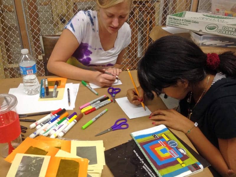
This week Basic Drawing met for the fifth time and Stained Glass met for the fourth time. Here’s where my stained glass panel is so far:
The pattern paper is on top of the magenta and brown pieces, and the green (top row center) looks black in this picture, so you’ll just have to imagine those colors for now. I think the colors we found were perfect, though — I had a lot of help from fellow stained-glass student Tiffany in finding all the colors I needed for my piece, which was quite a feat. As Jimmy, the instructor, predicted, finding magenta was pretty much impossible, but we found something very close. And check out the cool brown streaky glass we found: Continue reading George’s Artistic Adventure: Week 4 1/2
We’re bringing you an extra edition of artist opportunities this week to let you know about two upcoming workshops you might be interested in:
Public Art Workshop
Sunday, October 21, 2:00 pm. Washington Project for the Arts, in collaboration with Arlington Public Art, presents a free, participatory lecture as part of the 2012-2013 Professional Practices series, for artists and project sponsors (developers, planners, private and public agency administrators) interested in sharpening their skills preparing for public art commissions. St. Louis based artist and Washington University Sam Fox School of Architecture Professor Ben Fehrmann will be our guest for Where to Start: Site Analysis and Design Thinking for Public Art. To attend, RSVP by Thursday, October 18 (today) to Christopher Cunetto at [email protected]. Seating is limited. For more information, click here.
Alexandria Artist Grants
Monday, October 22, 7:00 pm and Thursday, October 25, 2:00 pm. The Alexandria Commission for the Arts is conducting two workshops to provide information about its annual grant program. The goals of the Commission’s grant program are to encourage artistic excellence in the City; assist Alexandria-based arts organizations in improving their financial, administrative, and management capabilities; and provide individual artists with opportunities to create, perform, and present their works. Applications for grants are due November 16. For more information, click here.
Do you have your ticket for next Wednesday’s Art on the Rocks yet? To entice you, we have a preview of one of the cocktails created for the event. We stopped by Bastille to see Rebecca Dincher make her Potiron, which, if you know French, you’ll know is pumpkin-themed:
The Potiron is inspired by a photograph by Tom Roberts in our October “Color Sphere” exhibit.
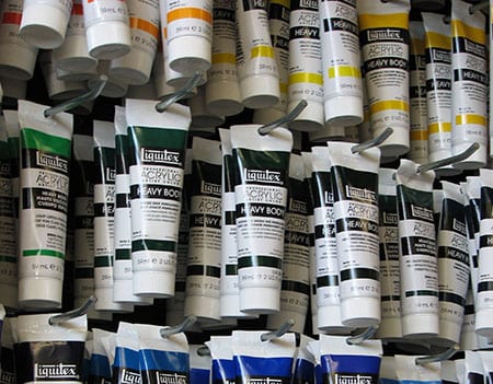
Liquitex acrylics for sale in The Art League Store.
Liquitex artist Tony Zatzick will be back at The Art League next week for another free demo on topics including color mixing, permanence, product history, mediums, pigment characteristics, and techniques! Attendees also get a free bag of samples to take home.
The demo will be Monday, October 22, 2012 from 2:00–4:00 pm. It’s totally free, but you do need to register by contacting the Gallery at [email protected] or 703-683-1780.
Tony is part of the Liquitex Artist Outreach Program and he last came for a demo in February — read about it here.
See below for upcoming deadlines and other opportunities. Be sure to make it to the Gallery this Thursday for Art Insurance 101, the latest in our Fall Lecture Series! You can click the banner above for past opportunity posts.
Art Insurance 101: An Overview for Artists and Collectors Thursday, October 18, 7:00 pm in The Art League Gallery. Jane Stapleton and Beth McGurk of Art Ingenuity Insurance present a timely discussion of methods for artists interested in obtaining insurance for their own work and collectors seeking to insure their collections. Please RSVP for this free event to [email protected] or 703-683-1780. Continue reading Artist Opportunities: October 16, 2012
Join us a couple days a week for Art League Happy Hour (yes, we like to go to happy hour a couple days a week). During Art League Happy Hour you can read up on Art on the Rocks news and see video clips of our participating bartenders creating their artistic cocktails.
We stopped by Chadwick’s today to see bartender Paul Fehn show us his drink, dubbed “SC III” after Summer Color III, the Colleen Henderson print it’s inspired by:
“Summer Color III,” pigment print by Colleen Henderson.
With blueberry puree, rye whiskey, triple sec, lemon juice, and sprite, the SC III starts off tart and grows sweeter.
Check back soon for more videos! Tickets are on sale now for Art on the Rocks. More information about the party is here.
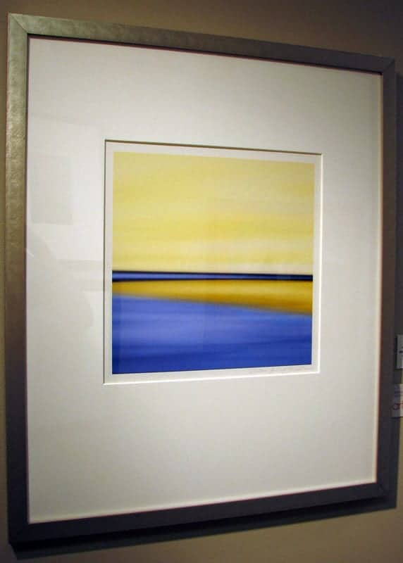
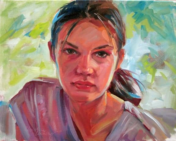
In this month’s “Color Sphere” exhibit, the Gilham Award went to Christine Lashley for Margaret, an appropriately colorful portrait of her daughter. Juror Lee Boynton called the oil painting “evocative and full of great color and emotion.” We asked Christine about the painting, her views on color, and her artwork in general.
How was Margaret painted?
Christine: Margaret was painted “alla prima” (all at once) with M. Graham oils – these paints are extra buttery and I can layer strokes of bright colors together and get a juicy look. I had my daughter pose for me and I took some photos of her slouched on the sofa with the afternoon light streaming in the window behind her. I had painted her from life (in watercolor) and I wanted to an oil in the studio. When I was painting I asked her to come in to the studio and look at me a few times.
The idea for the painting was how she looked to me at the time she was sitting on the sofa. I liked that she looked natural, and not posing with a frozen smile for the camera. I wanted to portray a mix of my feelings as her mother and of her feelings as an individual.
“Margaret” by Christine Lashley
Since this month’s theme was color, what is your philosophy on color, and how do you know which one to reach for — for example, the reds and blues in the subject’s hair? What is color’s place in a successful painting?
When I fully understand a subject and have a very clear idea of what to paint and why, the color choices seem to jump onto the canvas. Color is personal. So, my color choices are very intuitive. It’s a wonderful feeling when a painting seems to paint itself. That’s what happened here. At first, I had a more traditional (vertical) composition sketched in with a burnt umber drawing (much more conventional). But this looked boring and did not convey an emotional impact very well, so I wiped the whole thing off, turned the canvas horizontal, and started the head larger, with bold, bright color and a large brush. It was really fun to start over and slash away at the first, boring attempt. Continue reading Q&A with Award-Winner Christine Lashley
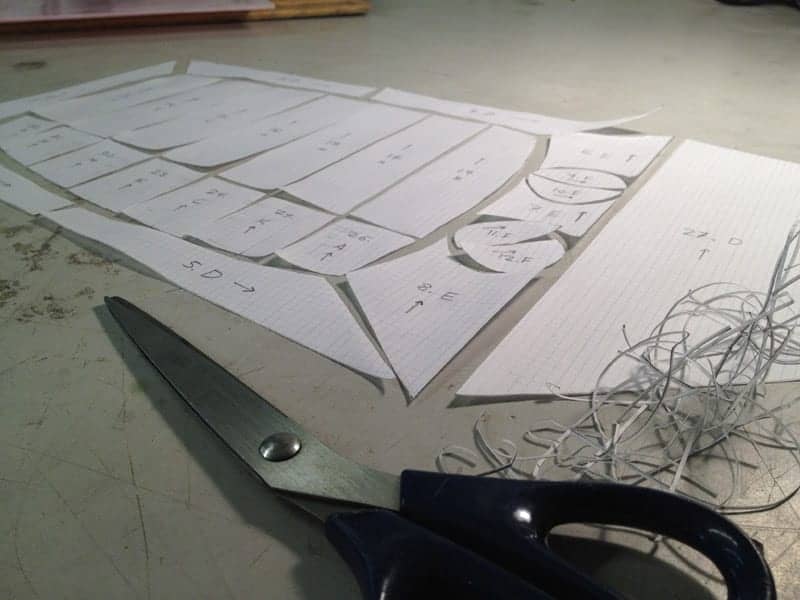
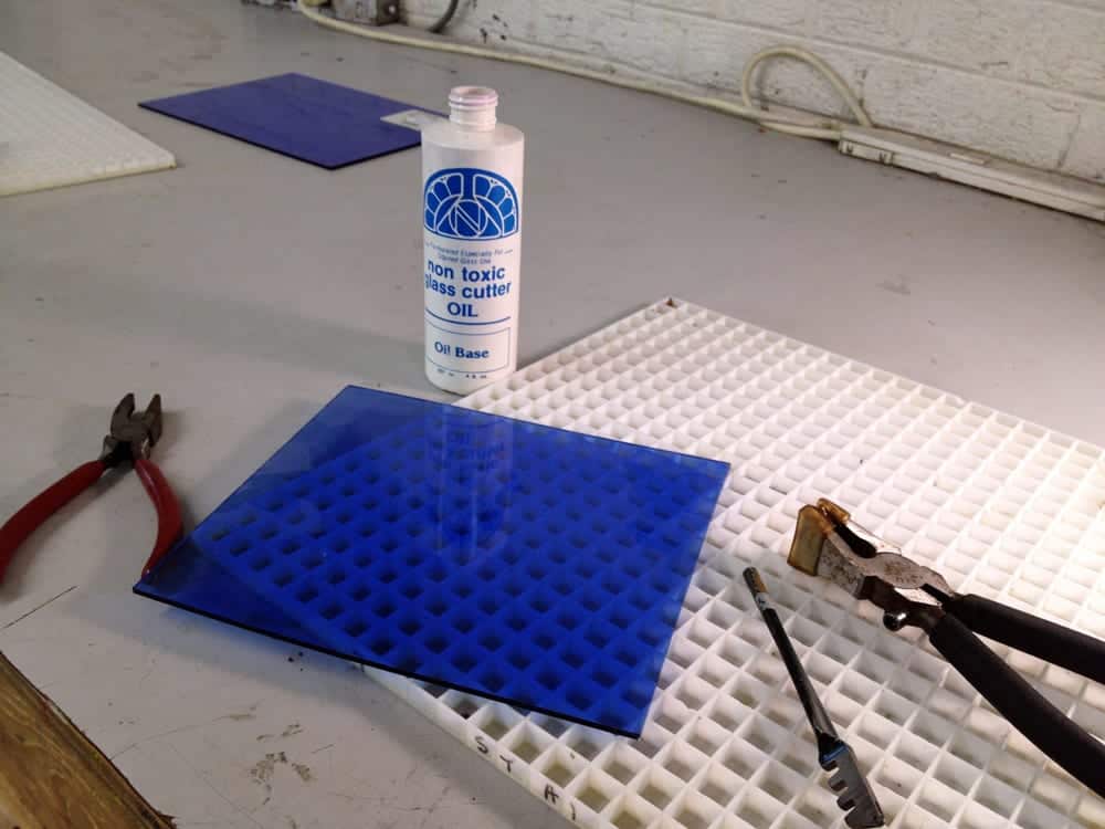
I had another fun Stained Glass class today and got to see my project start to take shape. After tracing my pattern onto vellum paper last time, today it was time to cut all the pieces out. Here’s what that looked like:
To cut out the pieces, I used special pattern shears for the copper foil technique I’ll be using later. They work like regular scissors, but they have three blades instead of two, so the middle one cuts out the 1/32” gap I’ll need between the pieces of glass. You can see the little pile of paper it takes out. Continue reading George’s Artistic Adventure: Cutting Glass
In our continuing quest to be helpful, we’ve gathered some inspiration-themed links artists might find useful or interesting. Click away!
Inspiration, education, and entertainment all in one: it’s easy to get lost in the videos and interviews posted at Those Who Make. They aren’t all artists, but they all use their hands to make — clothes, blown glass, vodka, honey, etc. — in some very well-made videos.
Make your own Jackson Pollock drip painting! Try clicking your mouse to change colors.
Featured in a recent post on our Facebook page, the Google Art Project is a nifty way to look at lots of artwork from around the world. You can browse by artist or collection, zoom in on famous works, make your own collections, and even do a virtual walkthrough of some galleries, Google Street View-style — for example, see the Rijksmuseum without the trip to the Netherlands.
Here’s a list of The 9 Warning Signs of an Amateur Artist — a guide to “changing your attitude and the way you think about your art.” Skinny Artist has lots of great articles on things like inspiration and sharing your art online.
Speaking of amateurs, you’ve probably heard about the much-derided amateur restoration of the fresco of Jesus in a Spanish church. Did you also hear that the restorer wants a share of the donations the church has received since people started coming to see it?
To end on a happier note, here’s the story of a more professional restoration. MoMA’s Inside/Out blog has been documenting how their conservators document and repair damage to a pair of 60-year-old Jackson Pollock paintings. It’s some really interesting stuff!
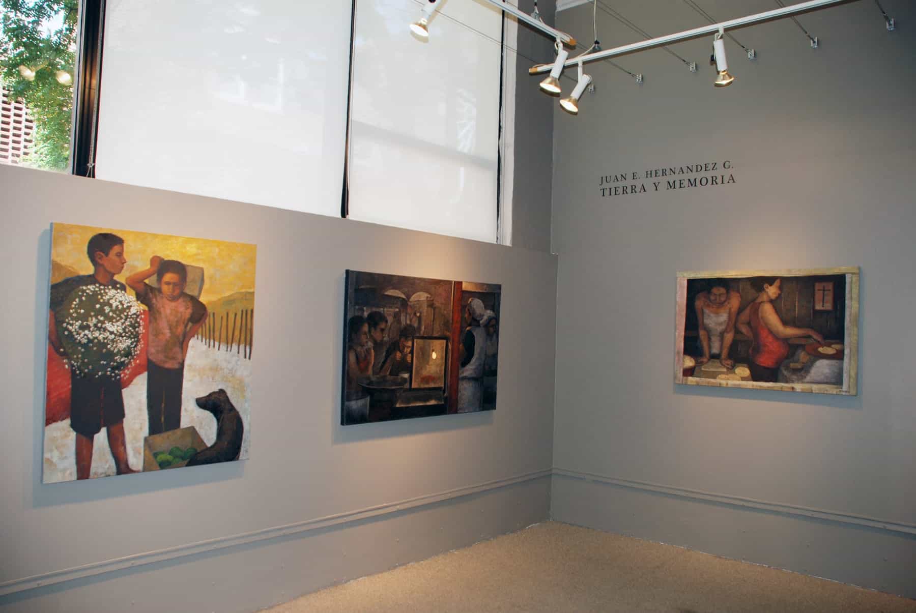
October’s exhibits are up in the Gallery and looking good! This Thursday, October 11 at 6:30 pm is the opening reception for “Tierra y Memoria,” an exhibit of paintings and linocuts by Juan E. Hernandez G., and “Color Sphere,” the juried group exhibit exploring color.
Both shows are open through November 5.
Artwork from “Color Sphere.” Foreground: “Orange Ladder,” fused glass, by Doris Ross.
Hernandez’s artwork takes everyday life in his native Honduras as its subject.
“My goal is not so much to make a representation of these scenes and their protagonists, but to express something about their human condition and the nature of their lives,” Hernandez said. “These pieces are filled with my deep feelings for these people who are part of a country that faces many social, economic, and political challenges.”
That was taken near the end of class, though I fixed it up some after that. In particular, instructor George suggested I work on straight lines (as well as centering the subject on the paper). I can definitely see what he was talking about, so I’ll be practicing my lines. I do feel better about the shapes and their relative sizes and distances from each other. The sphere in particular had improved by the end of class from this potato: Continue reading George’s Artistic Adventure: Shaping Up
Join us a couple days a week for Art League Happy Hour (yes, we like to go to happy hour a couple days a week). During Art League Happy Hour you can read up on Art on the Rocks news and see video clips of our participating bartenders creating their artistic cocktails.
With Art on the Rocks just two weeks away, the mixologists have already selected the artwork that will inspire their new mixed drinks.
The third annual celebration of art and cocktails will be Wednesday, October 24, from 6:00 to 9:00 pm. Click here to buy your ticket. Ticketholders can sample all six drinks — created by mixologists from Bastille, Chadwick’s,Columbia Firehouse,the Light Horse Restaurant, Red Rocks Pizza Napoletana,and Union Street Public House — and then vote for their favorite. There will also be live jazz by the Gassmann Duo and appetizers from the participating restaurants.
The evening’s libations will be inspired by specific pieces of artwork from “Color Sphere,” the October exhibit in The Art League Gallery. These are some of the pieces chosen so far:
“Painted Elephant, Jaipur,” photograph by Frances Borchardt, left, and “Starn Wave,” oil on panel by Dennis Crayon.
Brodie Evans from Union Street Public House will be creating a drink based on Frances Borchardt’s photograph of a painted elephant. Justin Matlak of the Light Horse Restaurant, one of the winners in last year’s tie decision, selected a trompe l’oeil painting by Dennis Crayon.
See below for upcoming workshops and deadlines. You can click the banner above to see past opportunities posts.
Art League classes & workshops
Get back in the swing of art classes this fall! Check out the school homepage for upcoming workshops. There are also a few weekly classes that haven’t started yet:
Free lectures
The Art League Gallery’s fall lecture series includes talks on art insurance and Adobe Photoshop. See our Lecture Series & Enrichment page for details and check back as we add new events. Please RSVP to the gallery if you’d like to attend one of these free lectures.
Starting this Saturday, October 6 at 8pm, you can catch Art League ads during Downton Abbey on WETA UK!
The WETA UK Event: The Complete Downton Abbey Starting October 6, WETA UK will present The Complete Downton Abbey on Saturdays at 8 pm through November 10.
Here’s how to tune in:
You can watch WETA UK in Greater Washington over the air via antenna, or on various cable systems as listed below.
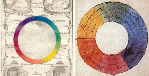
Color wheels by Ignaz Schiffermüller (1772) and Goethe (1810)
In honor of the October “Color Sphere” exhibit, today’s links are all about color!
Read all about Pigments Through the Ages, including a timeline of familiar pigments through the ages, from the ancient umber to titanium white, invented in 1921. You can see what they’re made of and what famous paintings use them. It also includes historically used pigments like “smalt.” Web Exhibits also has a page about the science of color and art.
Was Vincent Van Gogh colorblind? Some speculated as much after a Japanese scientist studying vision wrote that article last year, showing how some of Van Gogh’s paintings would appear to someone with a specific type of colorblindness. (He also wrote an app that allows anyone to try it for themselves.) It started quite a debate, though as the original author noted, the question of Van Gogh’s eyesight is out of the scope of his research. So, even though he probably wasn’t colorblind, it’s interesting to think about how an artist’s palette can be driven by their personal perception as well as by their artistic vision.
While you’re musing about that, test your own color vision with this online hue quiz.
If you’re a digital artist, digital photographer, or you’re posting images of your artwork on Facebook or your website, you want to make sure your computer monitor accurately reproduces the colors you want. Here’s an overview of the why and how for color-calibrating your monitor, camera, printer, and scanner for Macs or PCs. John Burgess also covers the basics of color calibration in his free Exhibition Prints lecture in November!
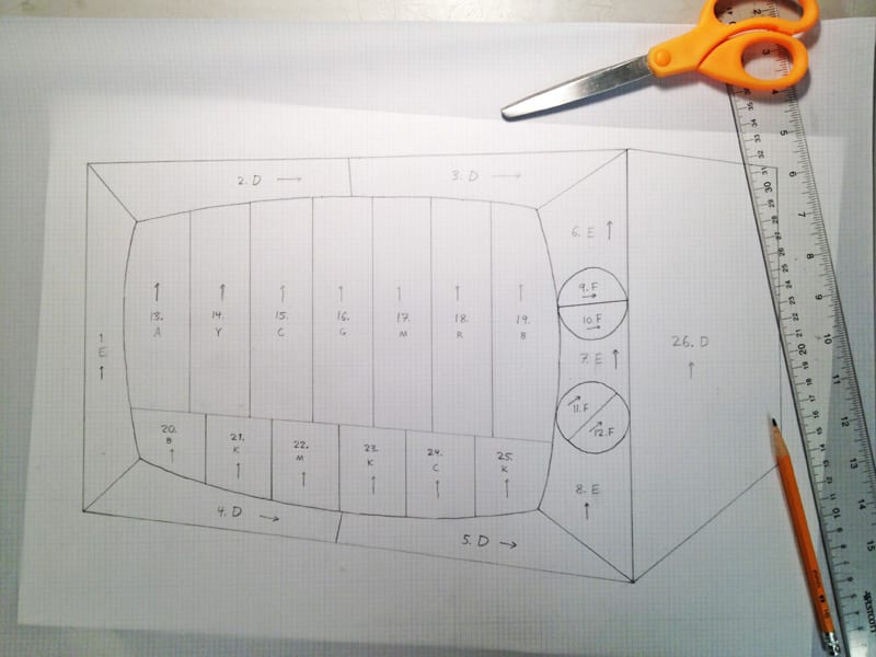
Things are getting underway in my stained glass class — today, we were supposed to come in with a pattern ready to go. After a lot of thought and Googling, I settled on making a stained glass TV. Here’s the pattern I ended up with today:
Today was my first class of Stained Glass with Jimmy Powers, which I’ll be taking Thursday mornings in addition to my Wednesday class in Basic Drawing.
We haven’t started in earnest yet, but I think our heads are swimming with possibilities. (I am one of three new students in the Thursday morning section; we also have some returning students working on projects.) Jimmy showed us what other students are working on to give us an idea of what we should expect — people make small and large panels, lamp shades, boxes, and lots of other things. Some students have been working for a long time on labors of love, but I’ll be starting with something more basic in hopes of finishing in nine weeks.
He also explained the difference between using copper foil and lead came. Lead is the classic look, and necessary for outdoor pieces so they can expand and contract in the weather. Copper foil is better for anything three-dimensional, like a Tiffany lamp (in fact, Jimmy told us that Tiffany invented the technique).
You can get a sense of the different kinds of projects people do in the class in this video with Jimmy from last winter:
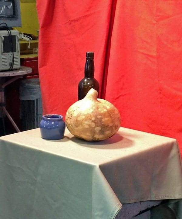
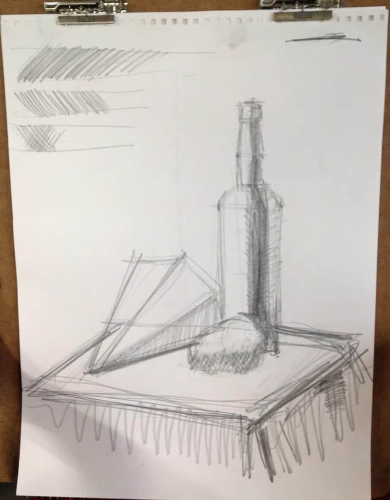
Instructor George started off class this morning with a quick demo of our still life setup, which included our bottle friend from last time as well as a pear-like object and a pyramid on its side.
He told us fear of drawing is a major obstacle to success, and we resolved to spend the rest of class making lots of marks and mistakes. We also discussed how to measure relative sizes of objects using a pencil held at arm’s length — the classic artist’s pose — which I tried to employ more since that was something I struggled with last time. Continue reading George’s Artistic Adventure: Drawing, Day Two
See below for details, and good luck! You can click the banner image above to view past opportunities posts.
Día de los Muertos
Deadline: October 5, 2012. The Torpedo Factory Art Center presents their 4th Annual Day of the Dead celebration from October 29 – November 4, 2012. Hosted by the Target Gallery, this exhibition of artist made altars and Day of the Dead themed artworks returns to the main floor of the art center. Artists are invited to submit artwork inspired by Day of the Dead, as well as Altar installations. Find details and entry forms here.
Maryland, DC, & Virginia artists
Deadline: October 29, 2012. OPTIONS 2013 is the fifteenth Washington Project for the Arts biennial exhibition of unrepresented artists from MD, DC, and VA. Open to artists working in any media, OPTIONS highlights the breadth and diversity of artistic practice in the area. Gerald Ross, curator for OPTIONS 2013, encourages submission of works in all media, including (but not limited to) film, video, performance, sound, new media, painting, photography, sculpture, and drawing. A catalogue will be produced to accompany the exhibition. Participating artists will receive a $300 stipend. For more details, click here.
Photography exhibit
Deadline: November 14, 2012. Artists residing in the United States, Puerto Rico and Canada are invited to enter Focal Point: Fine Art and Creative Photography at the Maryland Federation of Art. The selected works will be on exhibit in the MFA’s Circle Gallery from February 1 through February 24, 2013. For more details, click here.
From The Art League’s Paint Alexandria event in 2009.
In our continuing quest to be helpful, we’ve gathered some miscellaneous links artists might find useful or interesting. Click away!
Because perspective is always useful: the experience of a juried art show, written by an artist and a juror. The takeaway: whether your artwork is accepted or rejected, don’t forget one juror’s opinion is just that!
Play around with this new Virtual Paint Mixer by Golden, and check out their explanation of the difference between monitor colors and the pigments in your paint.
Artist Daily has a good overview of what copyright means for artists in their free e-book, Copyright 101 For Artists (note: you’ll have to register for free with Artist Daily to download the PDF). It has basic tips on your rights, the rights of other people whose work you might use, and more.
Attending one of The Art League’s travel workshops or flying with your art supplies for another reason? Tip: Don’t pack any solvents or flammable materials, and consider buying new supplies at your destination and trying something new. The Mindful Artist has a useful article with more advice for traveling with art supplies — and here’s another from Outdoor Painter.
Artists: do you blog? Have you considered starting one? If you have spare time, blogging can be a great way to keep in touch with the people who follow your work, and a place for new people to find you.
Why start an artist blog? There are lots of reasons, but here are a few:
Share the why and how behind your artwork.
Show works in progress, and connect with your fans and buyers. They can keep up to date on your new work and shows by signing up for your RSS feed or an e-mail newsletter of your blog posts.
Ask your readers questions, and get comments on your posts.
Improve your search engine rankings and make it easier for people to find you online.
That said, blogging isn’t for everyone. You should blog only if you have the time and energy, and something to say.
If you already have a website, your platform might include a blogging function so you don’t need to maintain a separate site. If you don’t have a website, try WordPress (which is what this blog runs on) — it’s free, and you can use it for both your blog and the rest of your website. (Other popular options are listed below.)
We asked some Art League artists who blog for their perspective on everything. Read to the end for some resources that can help you with starting an artist blog and ideas for what to write about.
“Reston Founder Robert (Bob) Simon: Face #100” by Jill Banks. This was the final painting in Jill’s 100 Faces in 100 Days project, which was chronicled on her blog. You can read about this final piece here.
Jill Banks never read blogs before starting on the suggestion of another artist, but she says she finds it easy and interesting to write about life as an artist. Artists, collectors, and people who are just interested in art read her blog. She says people get attached to paintings when they are just images of works in progress, then they are thrilled to see them in person: “it already feels like it’s a part of them.”
Jill’s “100 Faces in 100 Days” project, in which she painted 100 volunteer models from January 1 to April 10 last year, was announced on her blog and featured every day there while it was going on. That’s probably when her blog was most popular, she says, with people checking in to see the latest post and see photos of the portraits. (Jill includes an image with every post, which is considered blogging best practice.)
“It really built a following,” Jill said of the 100 Faces chronicle. Articles like these, which allow readers to follow an ongoing project and to connect with the stories behind artwork, are perfect for artist blogs.
“And Not a Drop to Drink” by Cindy Packard Richmond, from this post on her blog.
Like Jill, Cindy Packard Richmond uses Blogger, Google’s blogging platform, for her blog. But she says she doesn’t like it, citing concerns over difficulty in readers leaving comments and about image copyright. (We’ll feature tips about how to protect your art online in a future post.)
Cindy writes that she tries to blog at least twice a month, though she blogged more frequently during her solo exhibit at The Art League Gallery last year. She says her posts are more about her life than art, specifically. “My blog is not a true artist blog,” she writes. “Artist block comes up now and again, but I am more likely to grouse about tenants of our summer house or my son’s dog. I try to be droll.”
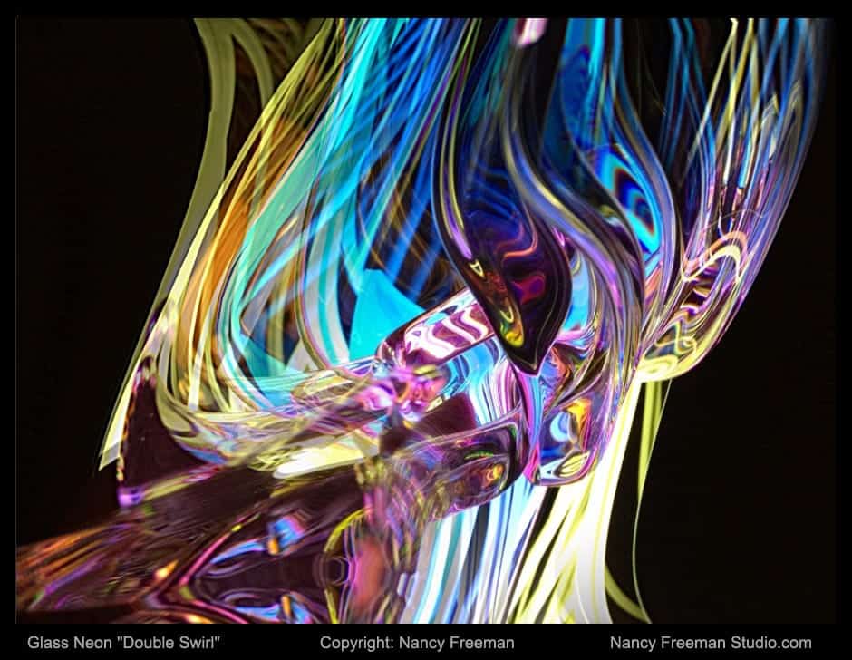
Nancy Freeman says that while her blog is only one part of her site, it’s by far the most active part. She tries to update it at least twice a week. Using Weebly, the system her site is built on, has been straightforward; she says that it’s producing the content that’s been time-consuming, in particular, photographing and editing images of her artwork.
“My site is a lot like a garden;” Nancy writes, “it’s more of a process than a product and is always a work in progress. And as with a garden, the rewards are in direct proportion to the time and effort you put into it.” You can read more of Nancy’s thoughts about her new website on her blog.
For other examples of artist blogs, Google some of your favorite artists or check out the links to Art League blogs in the right sidebar.
Thinking of trying blogging out? Here are some resources to help you get started:
Some of the most popular blogging platforms — see which one looks best to you:
If you’re interested in WordPress, The Abundant Artist has many useful posts to help you — as well as other advice on websites in general. Here is their video on how to set up your site, and this post has examples of themes that work for artists.
Here are six simple ideas for artist blog posts from Empty Easel. Remember, if it’s about art, and it interests you, it will interest your readers, too!
To read the introduction to this series, click here.
Today was my first drawing class, and it went well! The teacher, George Tkabladze — henceforth “instructor George” — had us jump right in by drawing the still life setup below.
Then he came around to give each of us pointers. I glanced around to see how everyone else was doing, and we all seemed to have recognizable objects on our paper.
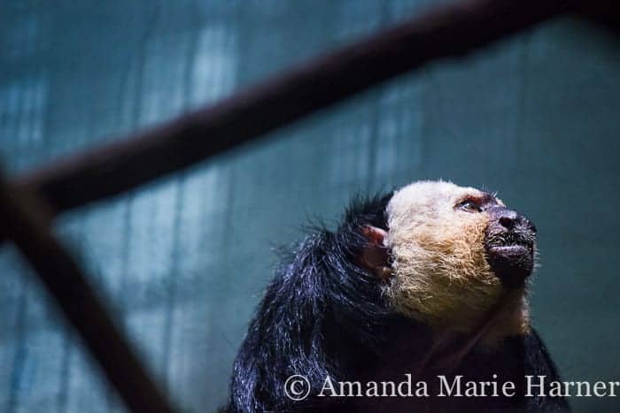
For the September All-Media Exhibit in The Art League Gallery, juror Judy Southerland gave special recognition to three works, and we’re featuring interviews with each of them. The third prize went to Another Day, a photograph by Amanda Marie Harner. (The first and second prize went to Miriam Keeler and Trinka Roeckelein.)
At age 17, Amanda is a junior member of the Gallery, and this was her first piece entered into an exhibit here. The juror called the image the “most movingly rendered face” among the submitted artwork. We asked Amanda about starting out as a fine art photographer and how Another Day was captured.
What are your thoughts on your first show at The Art League? Has your work been exhibited elsewhere?
Amanda: I am completely excited! I would have never imagined I would be doing something as awesome as this at such an early age. I feel honored to have my work displayed amongst so many talented artists. I guess you could say this is a step up from my high school’s art show.
Is there a story behind Another Day? Where was it taken, and what animal is pictured? Another Day was shot at the National Zoo, of a white-faced saki monkey. The image conveys the perpetual sentiment that yet Another Day will pass before the animals will be released from captivity.
“Another Day” by Amanda Marie Harner.
The juror said your photo had the most movingly rendered face of the submitted artwork. Do you do much portrait work? Was it challenging to get a good image of the monkey?
I actually do not do portrait work very often. I like to work with inanimate objects, however, I have been trying to branch out of my comfort zone. It surprisingly was not difficult at all to get the image. I just watched him for a few minutes through my viewfinder until I felt like it would make a good shot. I took three pictures, and one of them turned out great! Continue reading Q&A with Award-Winner Amanda Harner


 Simon: Face #100\"")